Contributions:
Brand Designer
Steirische Freshvibes is a small farm based in the Styrian region of Austria, led by Lukas Muhr. But this isn’t your typical local produce story. Lukas is on a mission to challenge the cliché-laden image of small-scale farming, one that often leans on greenwashing, sterile "premium" labels, and romanticized visuals.
Instead, Freshvibes brings the focus back to the farmer, highlighting the irony, grit, and daily realities of running a small farm. Through raw, humorous, and sometimes absurd video content (especially about the “egg business”), they aim to reconnect people with the humans behind their food, not just the marketing.
The problem:
The challenge:
How do you build a brand that feels fresh and youthful without alienating older generations? The challenge was to craft an identity that balances regional authenticity with a contemporary voice — bold enough to attract younger audiences, but grounded enough to be trusted by more traditional ones.
Rooted modernity:
Design that merges Styrian identity with a modern sensibility — no nostalgia, just vibrant rural life as it is today.
Multi-Generational Relevance:
A brand that speaks to both Gen Z and grandma. Playful and current, yet familiar and trustworthy. Transparency with Personality
Transparency with Personality:
Show the challenges of farming without turning it into a pity piece. Tell the truth with charm, wit, and style.

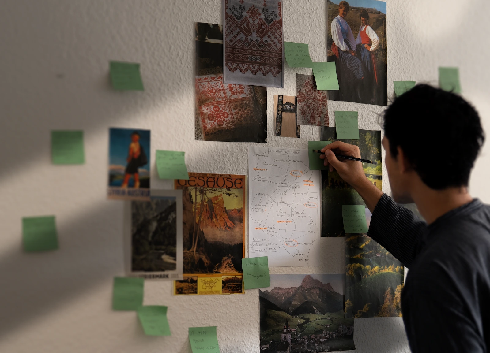
Exploration:
The process began with deep research into the reality of small producers in Styria. I analyzed common branding trends in the region, uncovering repeated clichés that felt disconnected from the raw authenticity Freshvibes wanted to champion.
The concepts:
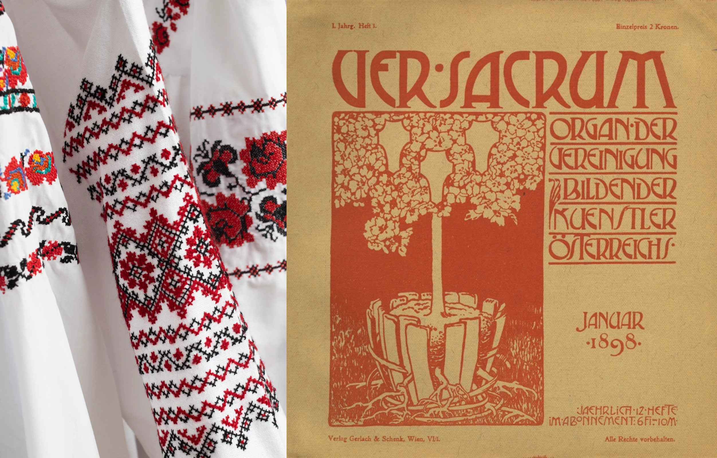
Digging deeper, I uncovered the area's cultural roots, from the rich tradition of village-specific cross-stitch embroidery, once a symbol of place and identity, to the impact of Styrian-born artists in the Secessionist movement, which broke with convention to forge a bold new visual language. These two elements, embroidery and secession — came to embody Freshvibes’ mission: honoring heritage while pushing creative boundaries.
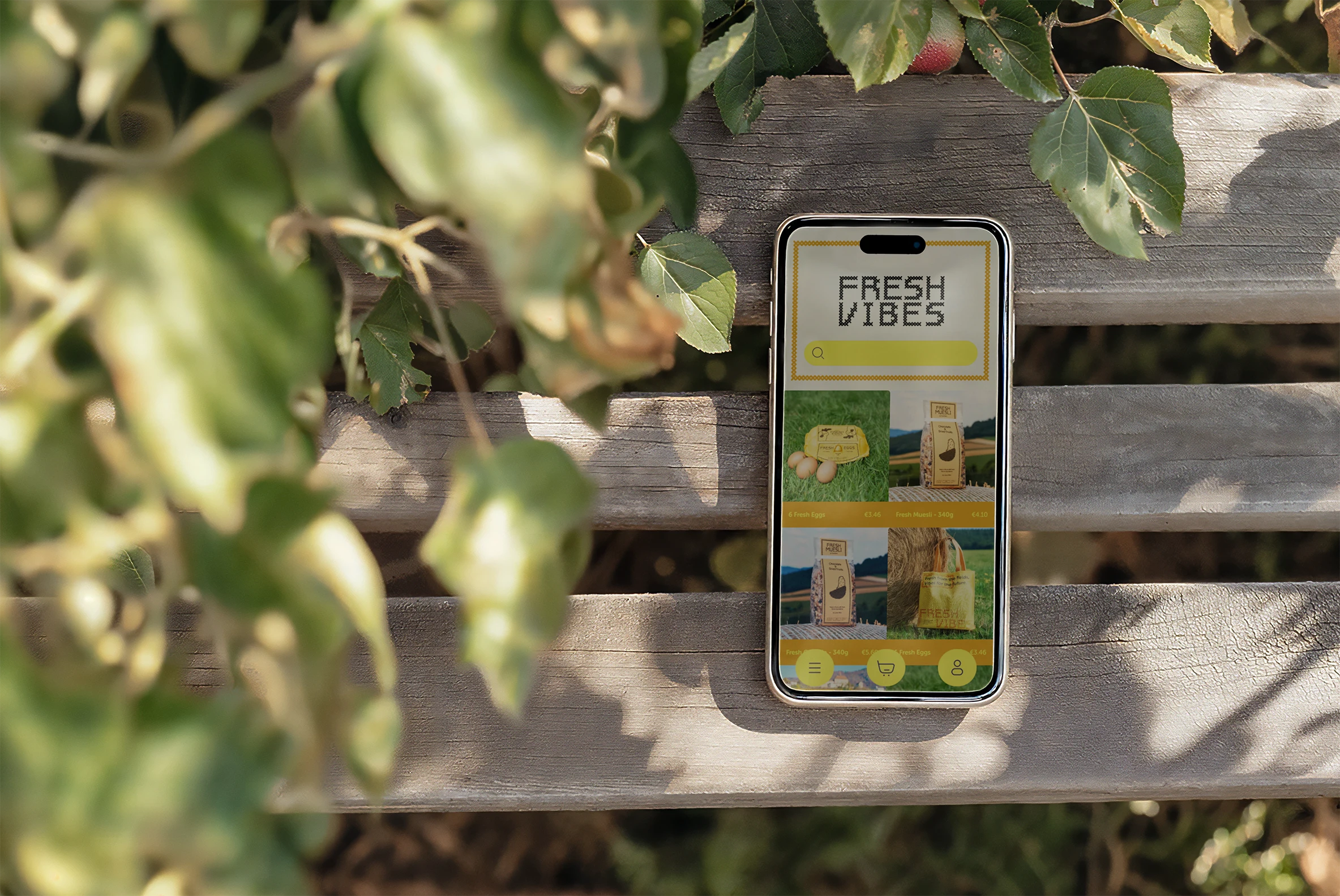
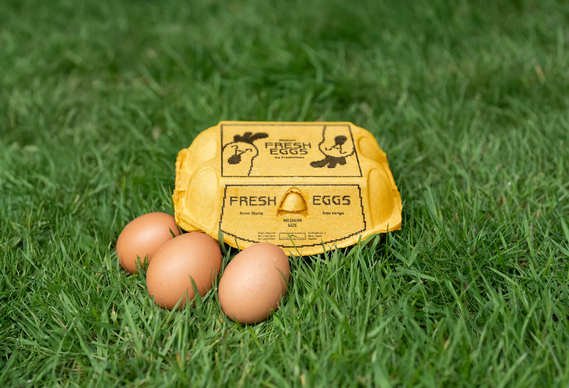
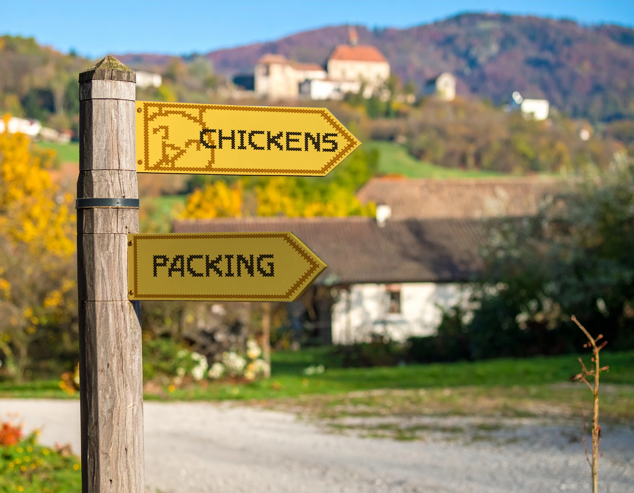
The Logo:
The custom logotype blends elements of Secessionist typography with cross-stitch aesthetics. It bridges tradition with innovation, creating a visual identity that feels both regionally grounded and distinctly fresh.
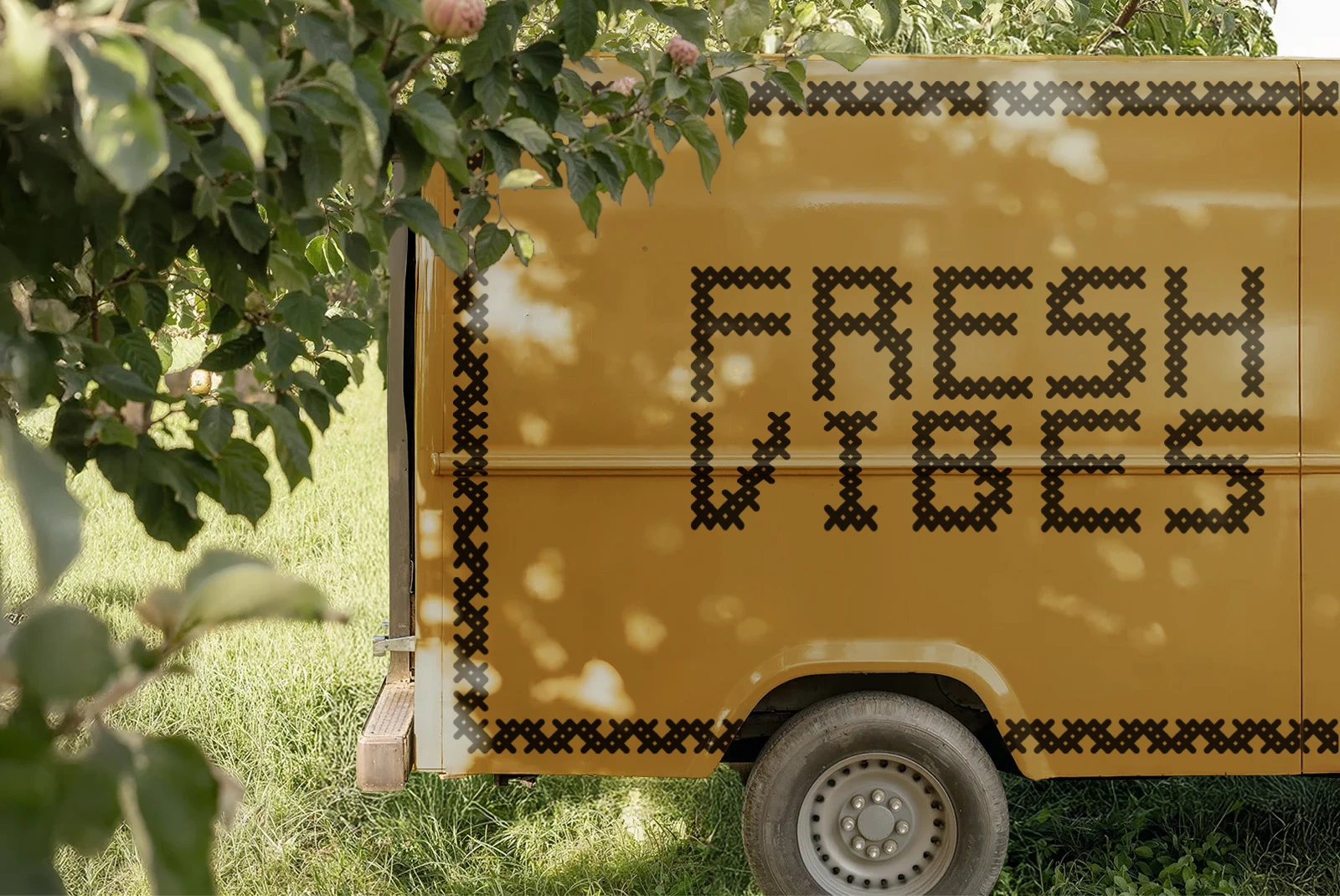
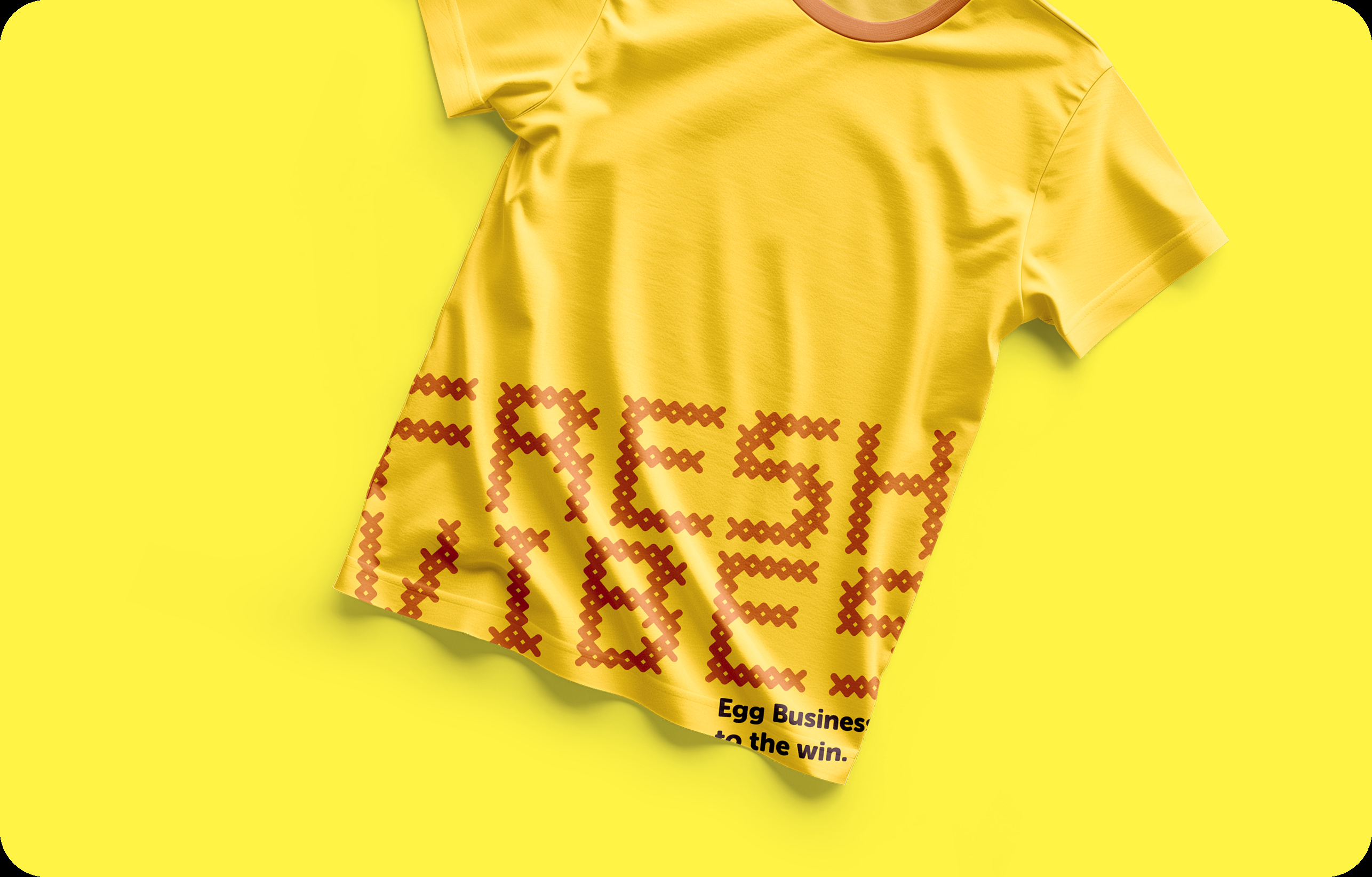
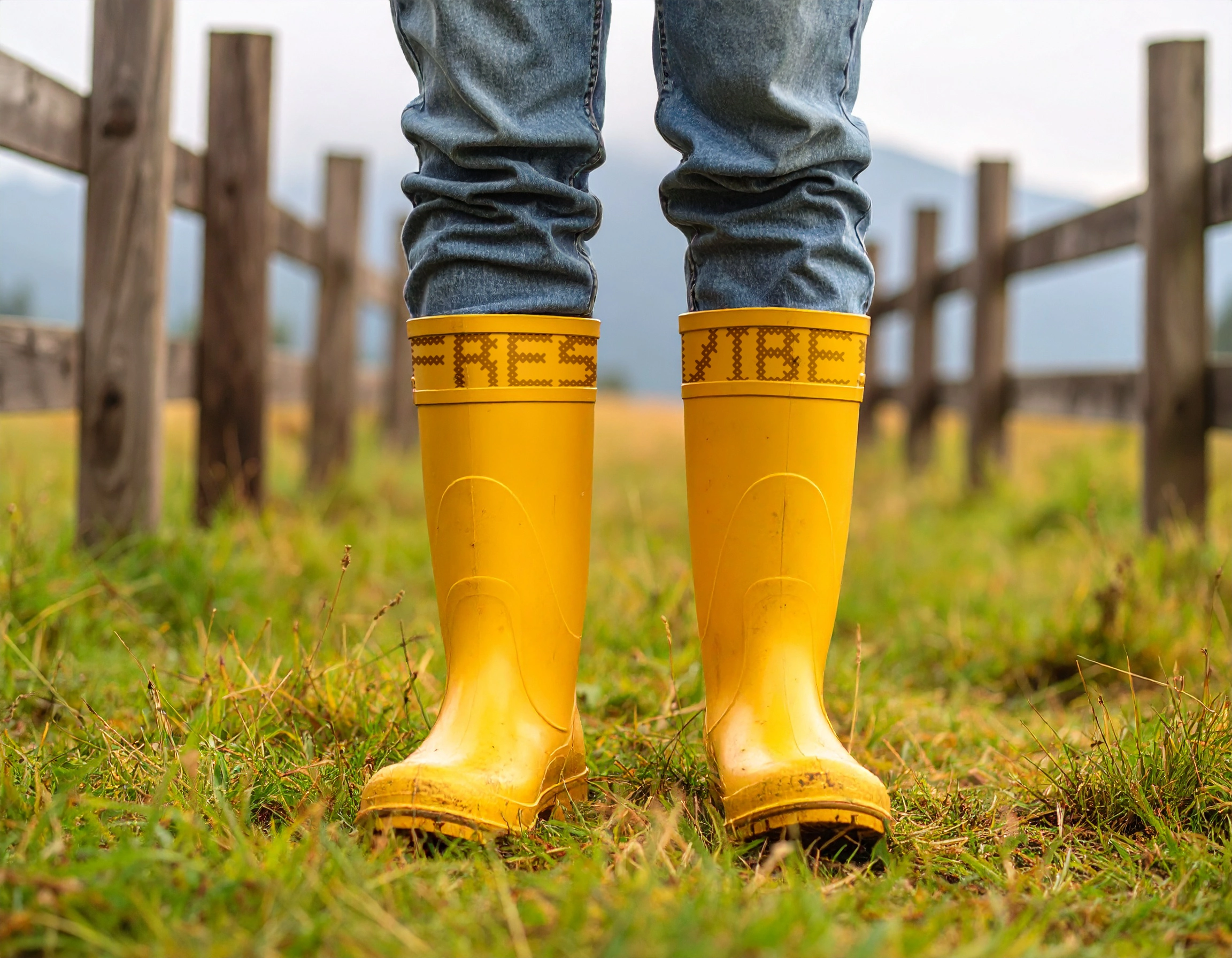
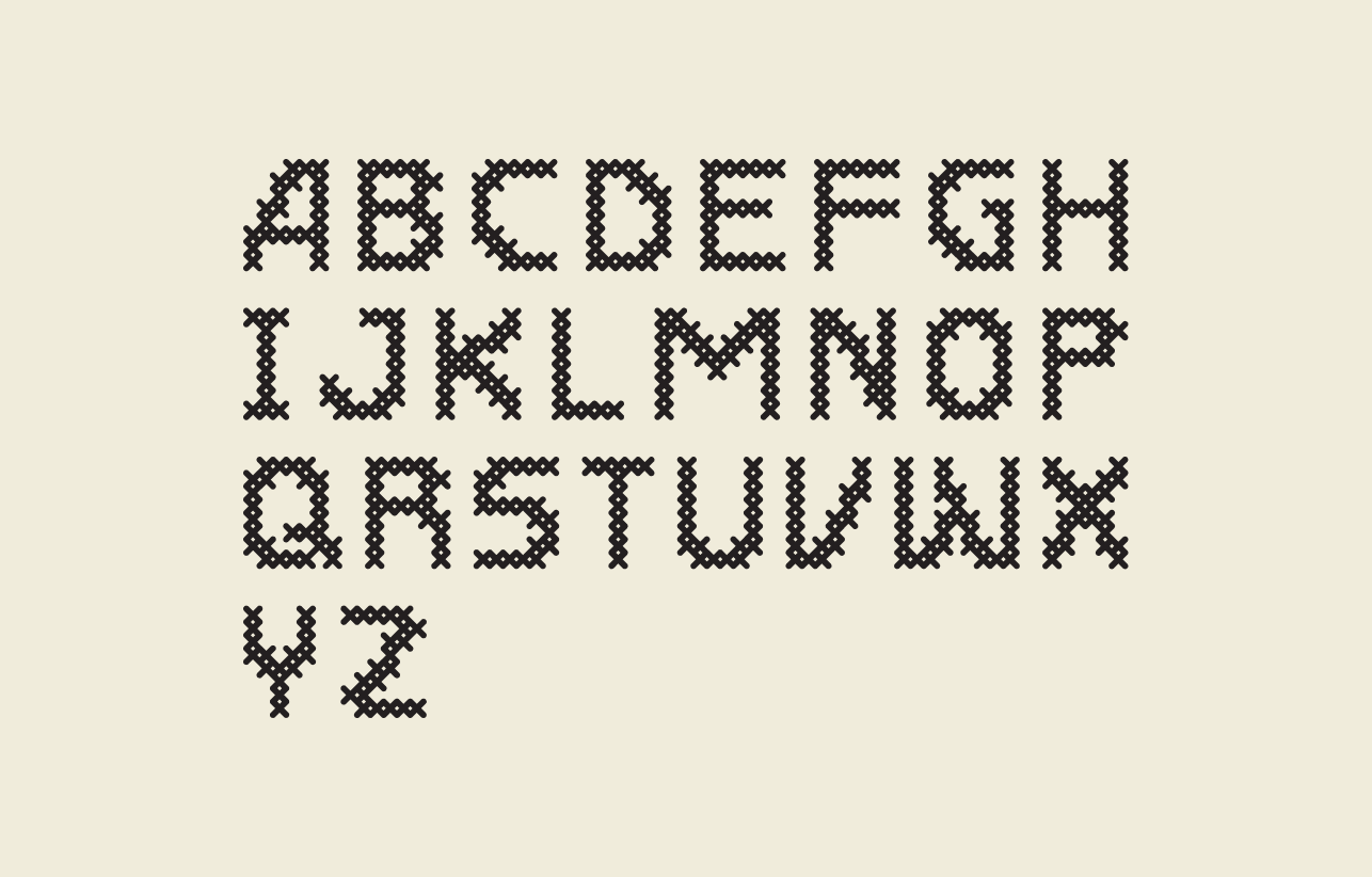
The Typeface:
A custom typeface, echoing both embroidery textures and secessionist forms, is used flexibly across the brand system — from digital headers to packaging. The cross-stitch "X" becomes a visual cue for connection — between people, places, and products.
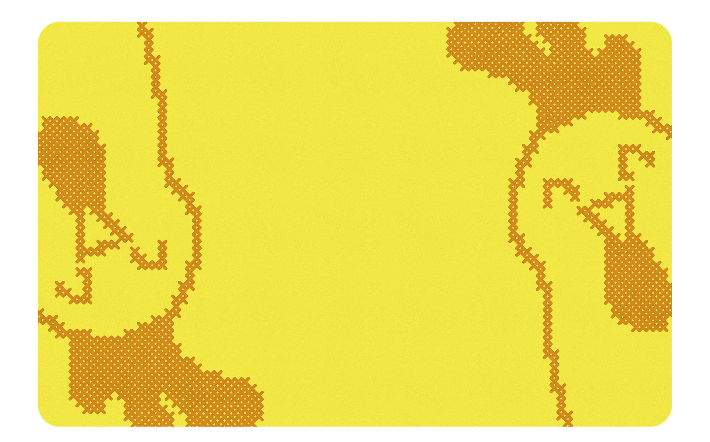
The Patterns:
Inspired by cross-stitch forms, the pattern system introduces variation and identity to each product line. It adds visual rhythm and acts as a flexible storytelling tool across mediums.
The Illustrations
Simple illustrations, built entirely from the cross-stitch pattern, bring a sense of playfulness to the identity.